
Concept - A Concept Site for Luxury Home Builders, Architects & Interior Designers
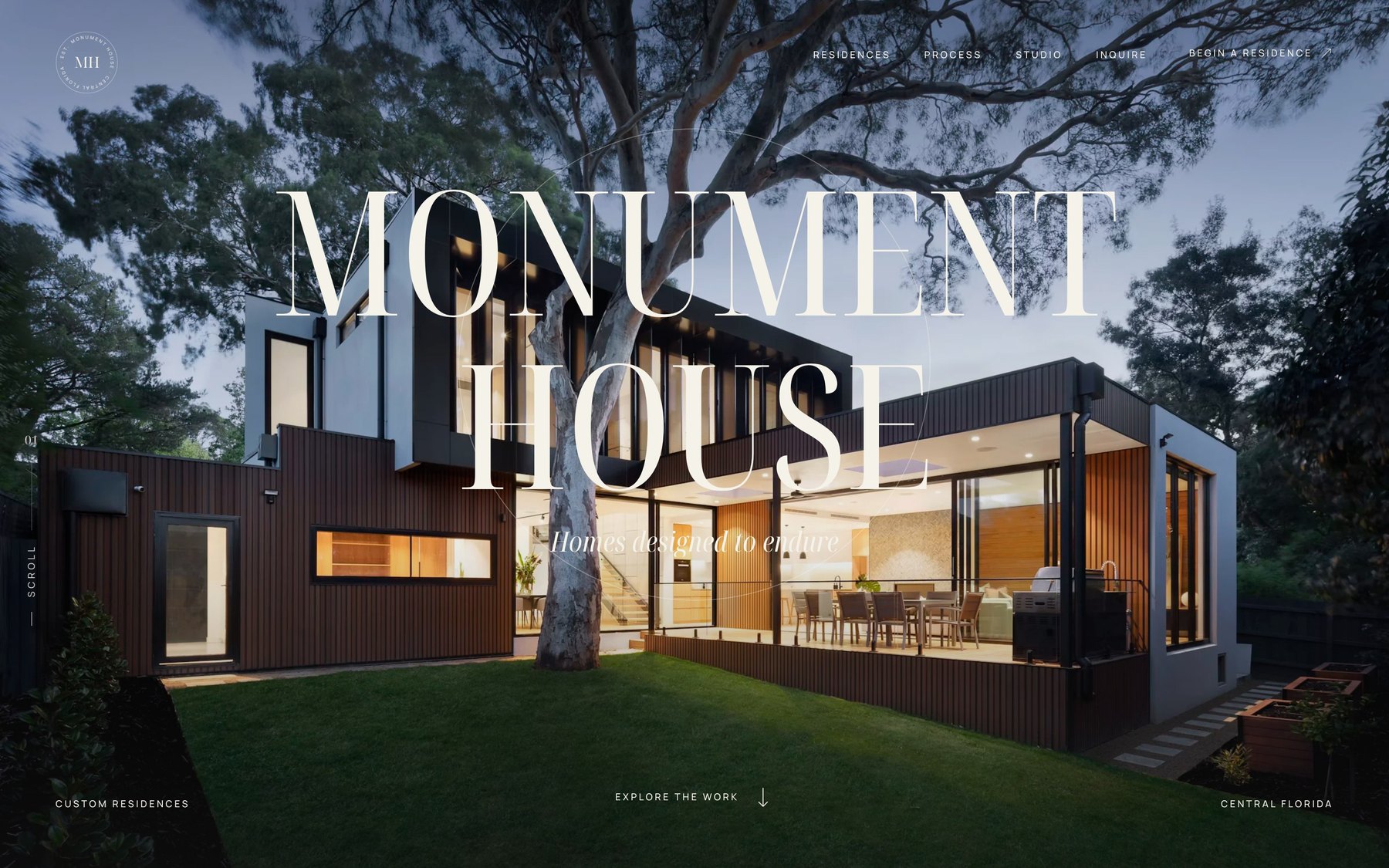
A concept build showing what a custom home builder, architect, or interior design studio could have instead of a dated portfolio site: a branded arrival, a scroll-driven residence gallery, and full project pages that sell the work.
- Concept
- Monument House, built by Arising Co
- Year
- Service
- Concept — Web Design & Experience
A Concept, Not a Client
Monument House is not a real company and this was not a paid engagement. We built it as a demonstration — a complete, working site at monumenthouse.netlify.app — because describing what a website could be to a custom home builder has never once landed the way showing them does.
It is aimed at three kinds of business that share the same problem: luxury and custom home builders, residential architects, and interior design studios. All three sell work worth six and seven figures. Most of them sell it through a website that looks like a contractor directory listing — a stock hero image, a grid of thumbnails, a contact form, and nothing that communicates why their work costs what it costs.
The work is extraordinary. The website is a brochure. This is what closing that gap looks like.
The Arrival Is Part of the Product
The site opens on a branded loading sequence — the wordmark alone on black, then an arch-shaped mask that opens onto the first residence. It takes about five seconds.
Five seconds is a real cost, and on most websites it would be indefensible. Here it is the point. A client who is about to spend two years and several million dollars building a house is not skimming. The arrival sets a register before a single word of copy is read, and it does the same job a well-made front door does on the homes these firms build.
Positioning Before Portfolio
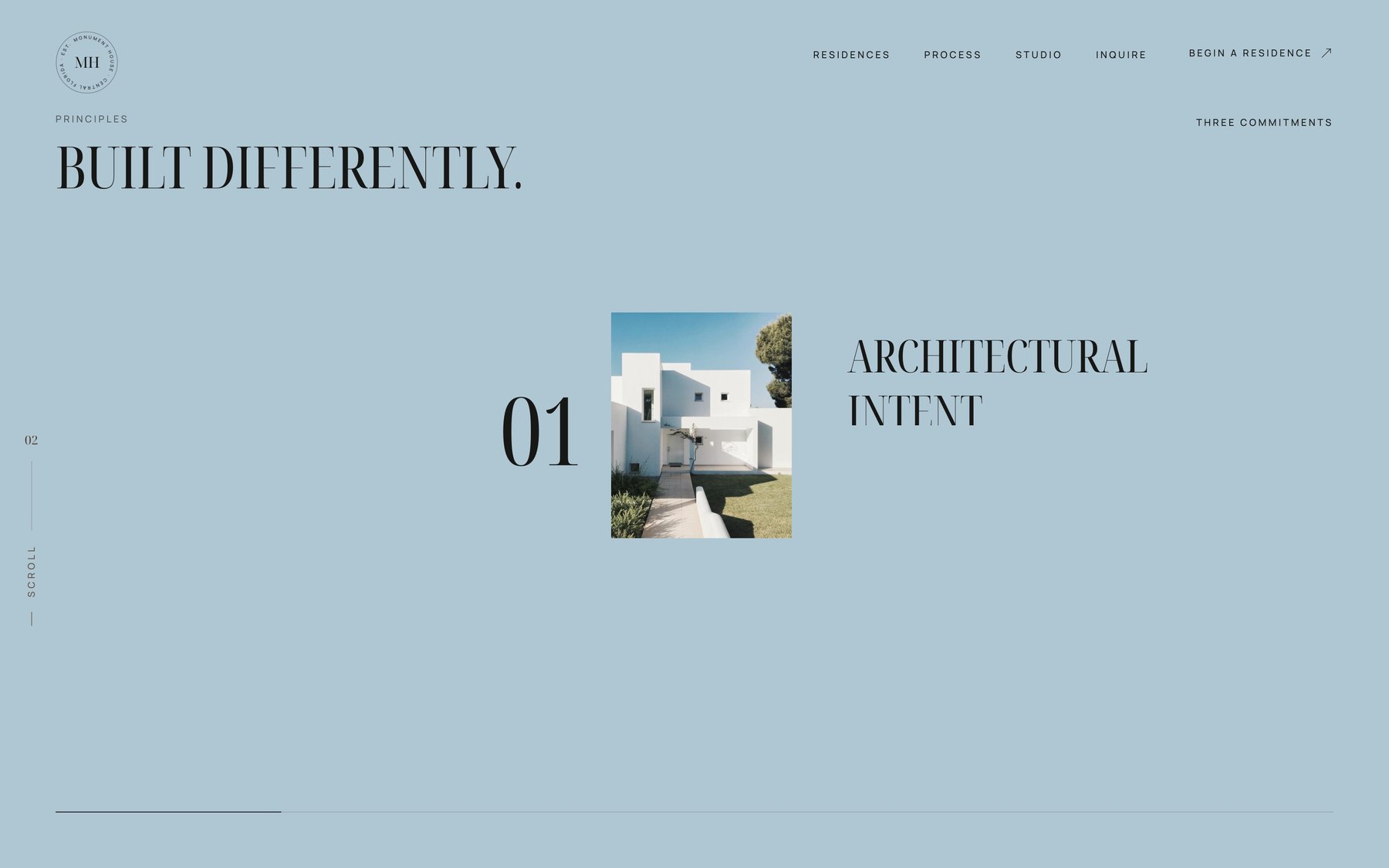
Before showing a single project, the site makes an argument: architectural intent, material honesty, built for generations. Three claims, numbered, each with an image.
This section exists to answer the question every high-end prospect is silently asking, which is not can you build it but why you. Builders who compete on portfolio alone end up competing on price, because a grid of beautiful houses looks much the same from firm to firm. A stated philosophy is harder to shop against.
The Residence Gallery Moves With You
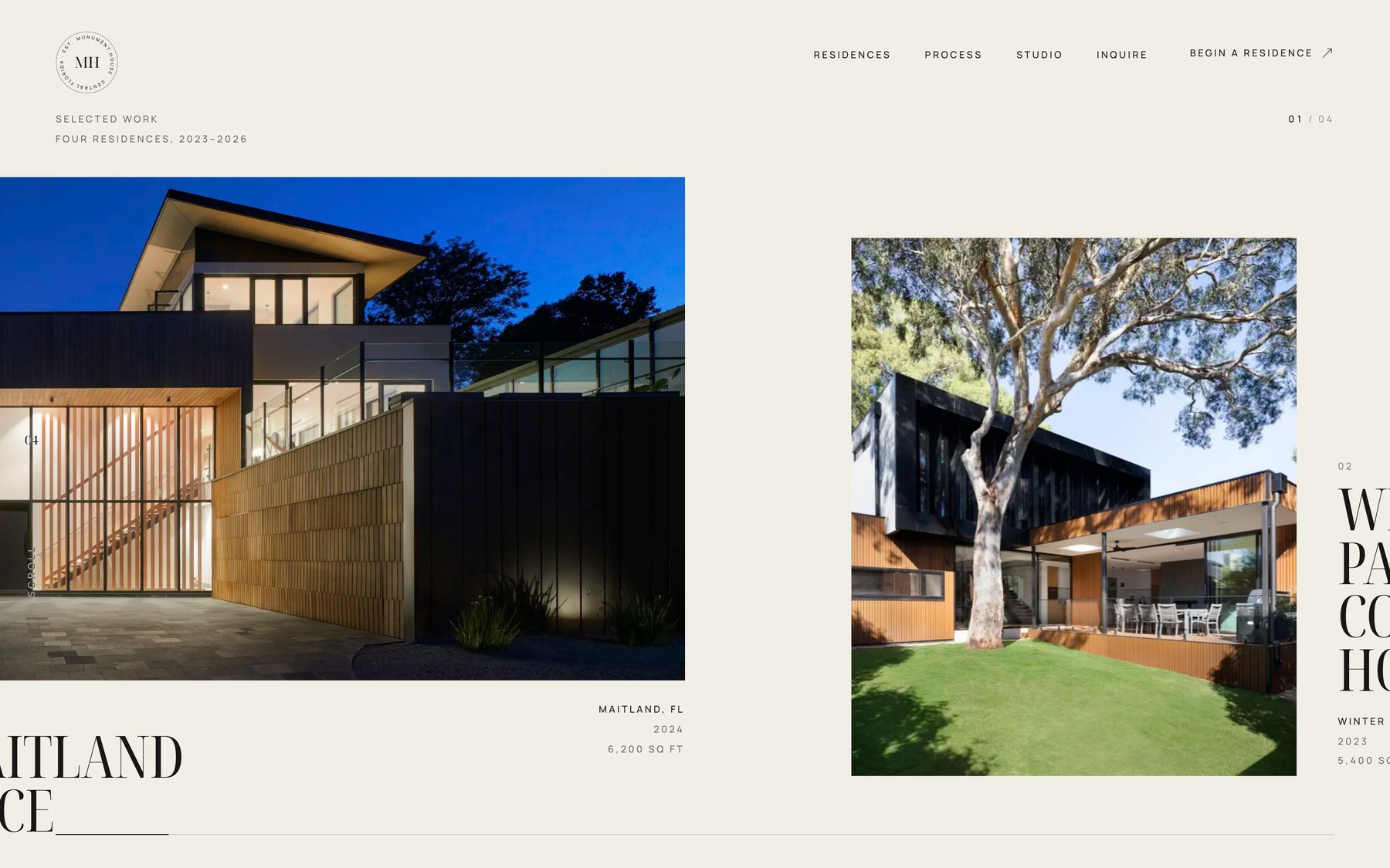
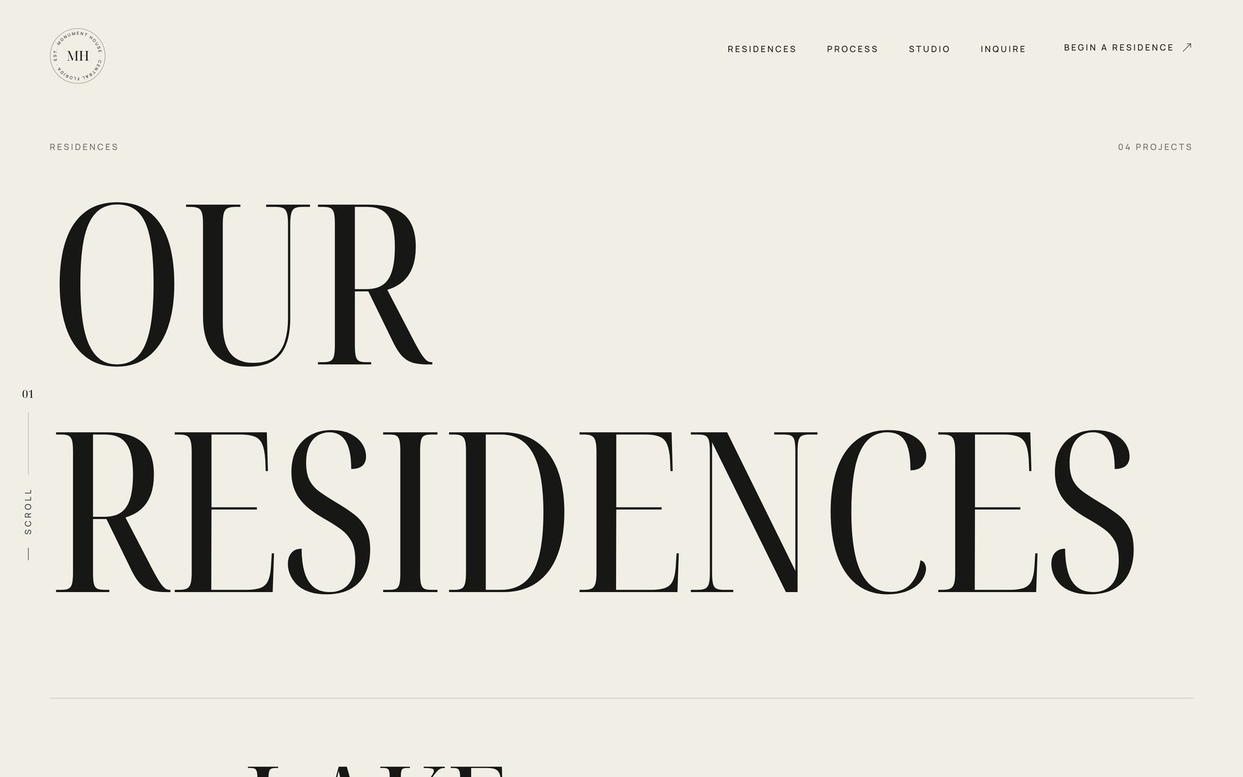
The portfolio index is a horizontal gallery driven by vertical scroll — as you scroll down, the residences travel sideways across the screen at a one-to-one ratio.
It is a small piece of engineering that does two useful things. It lets four large-format projects occupy one screen without shrinking any of them to a thumbnail, and it makes browsing the work feel like an exhibition rather than a search result. For a firm whose entire sales case is look at what we make, how the work is presented is not decoration.
Every Project Gets Its Own Story
This is the section that matters most for this audience, and it is the one almost every existing builder and architect site handles worst.
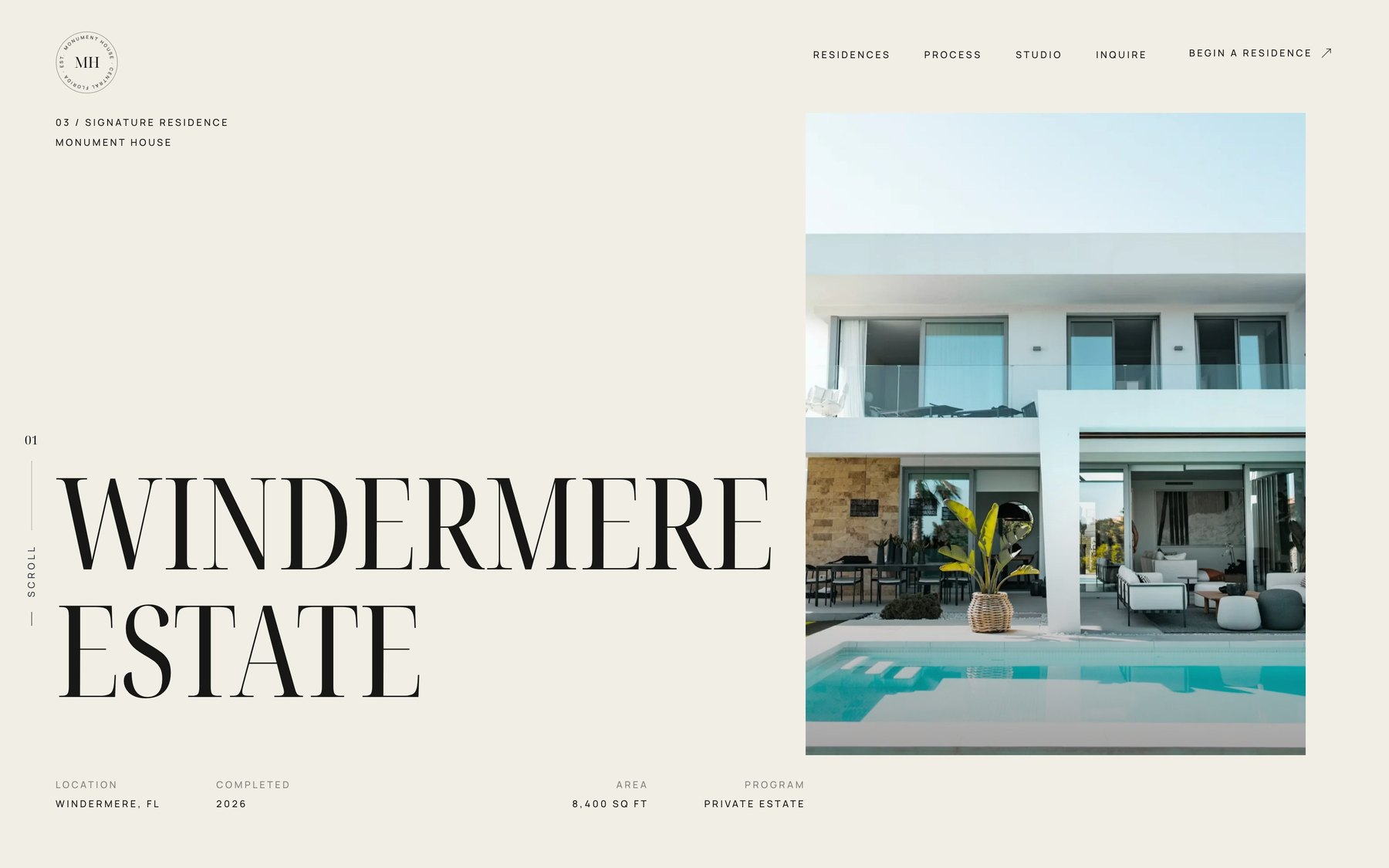
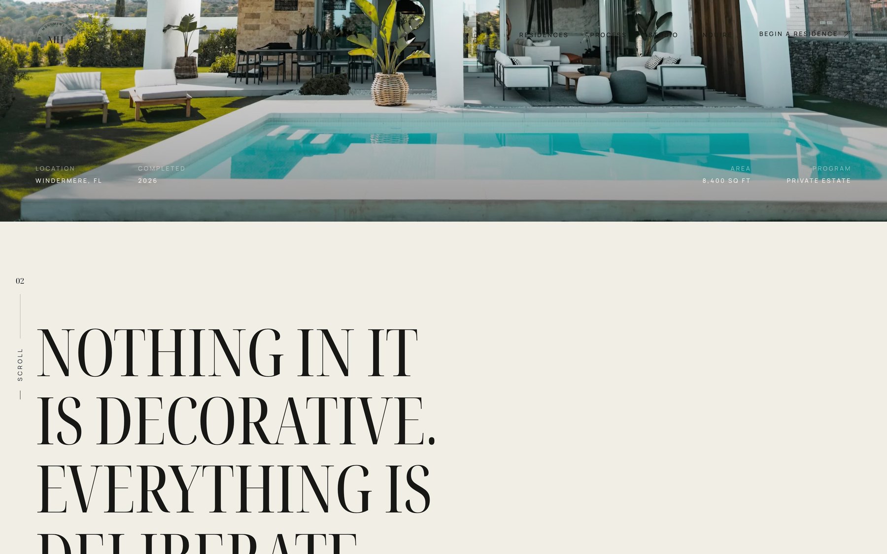
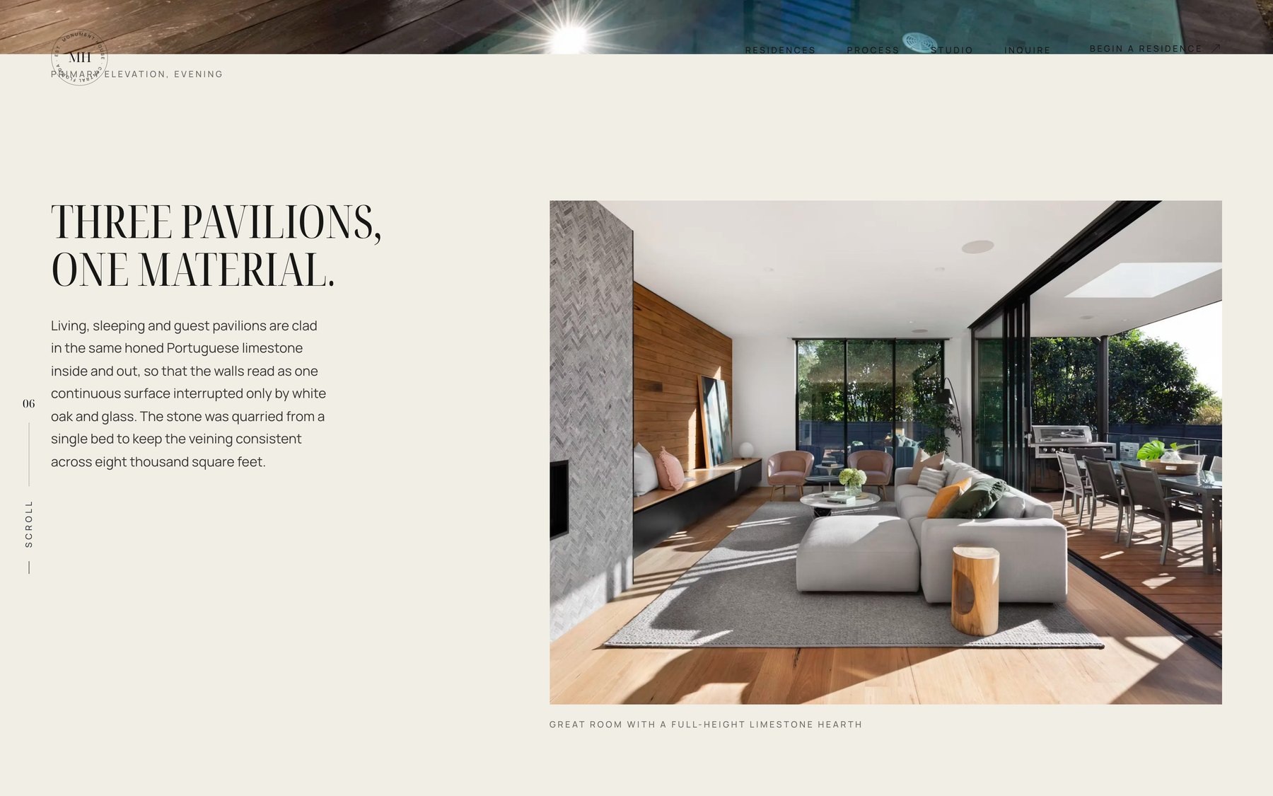
Clicking a residence opens a dedicated page for that home — not a lightbox, not a slideshow. It carries the location, year, square footage, and program up front, then moves through the house the way an architecture monograph would: the governing idea, the material decisions, the details that cost money and that nobody notices unless you point at them.
Materials Get a Section of Their Own
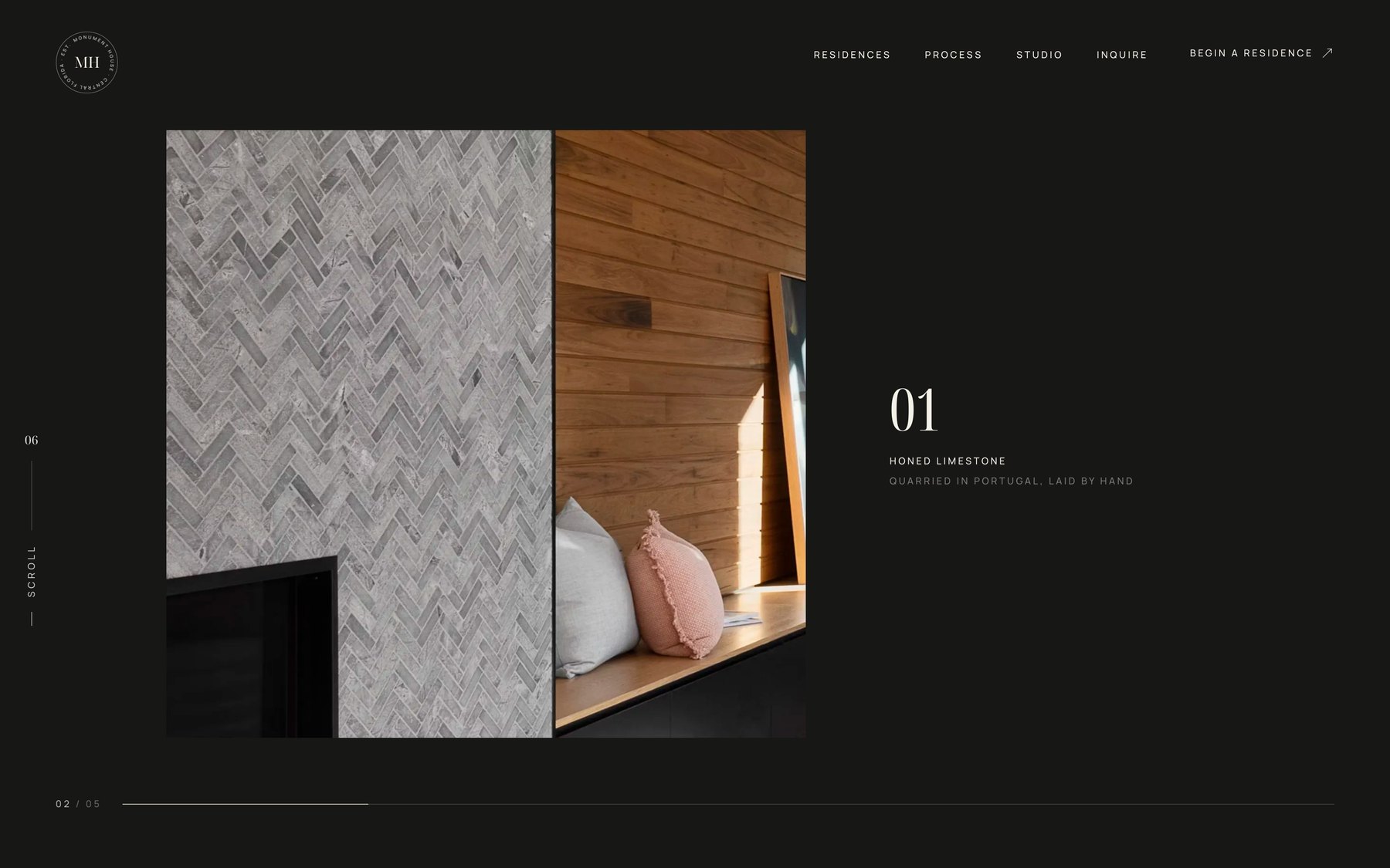
A dark, quiet run of the page given over to close-range material photography — honed limestone, timber, stone joints — under the line the difference is in what most people never notice.
Architects and interior designers lose margin constantly to clients who cannot see the difference between a considered specification and a cheap substitute. A section that shows the difference at close range is a commercial argument, not an aesthetic one.
The Process Section Filters the Wrong Clients Out
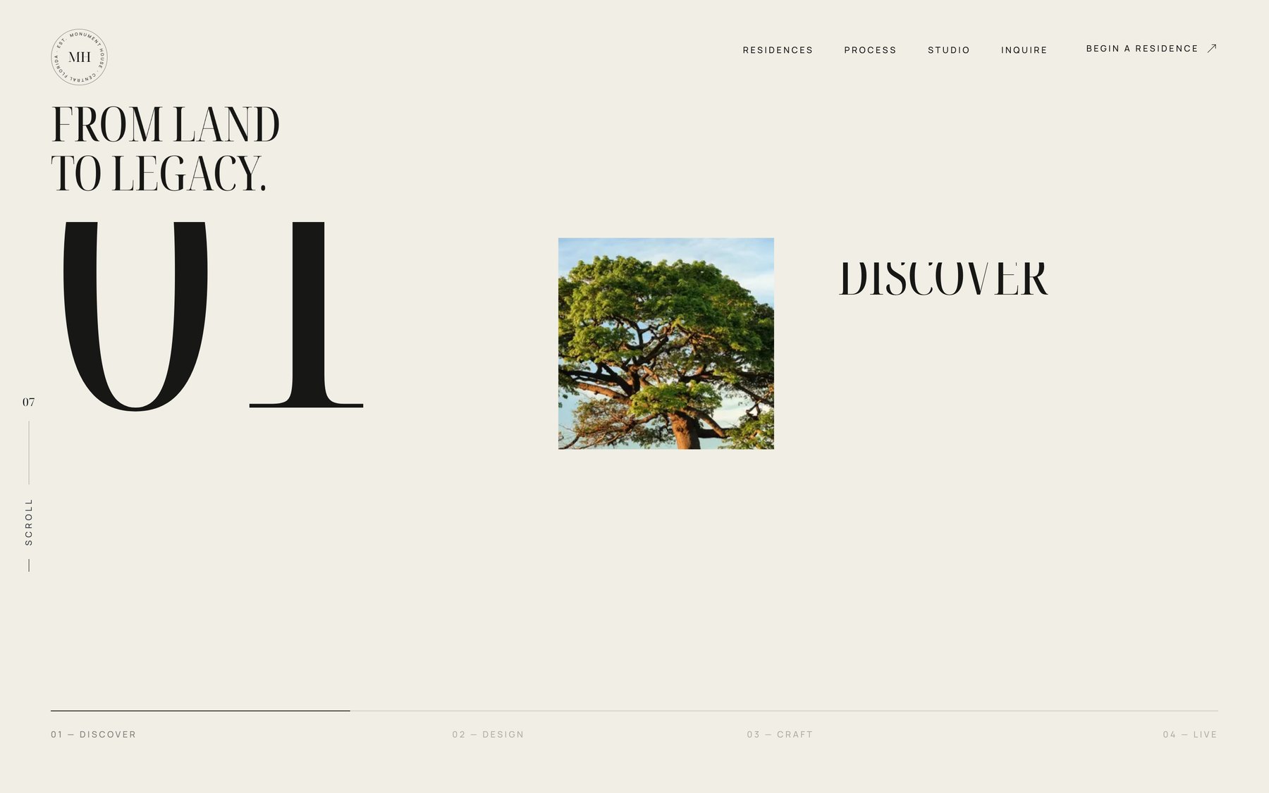
From land to legacy — discover, design, craft, live. A four-stage account of how the firm works and what each stage involves.
Every builder and architect we have worked with loses time to prospects who wanted something the firm was never going to do, or who had no idea a custom home takes eighteen months. A process section set out plainly is the cheapest qualification tool available: the people it discourages were going to be expensive.
And It Closes
What This Would Replace
If you are a builder, architect, or design studio, the site you have now probably does some combination of the following:
- Leads with a stock hero image or a slider nobody clicks through
- Shows the work as a grid of small thumbnails that open into a lightbox
- Has one Portfolio page where every project gets a paragraph and six images
- Says nothing about how you work or why you cost what you cost
- Was built on a template that a dozen competitors in your market also use
- Looks, on a phone, like it was designed for a desktop in 2017
None of that is a design opinion. Each one is a place where a prospect who was ready to spend real money decided you were interchangeable with the next firm.
This Is Not Only a Concept
The approach here is not theoretical. We recently rebuilt the site for Springhetti Group, a luxury outdoor living company in Wisconsin — fiberglass pools, outdoor kitchens, and hardscape — around the same principles: lead with the work, give each project real depth, and build for the search intent that actually produces booked jobs.
Their engagement rate rose 107.54% year over year, organic search now drives close to half their traffic, and their project calendar is booked into 2027.
Start the conversation
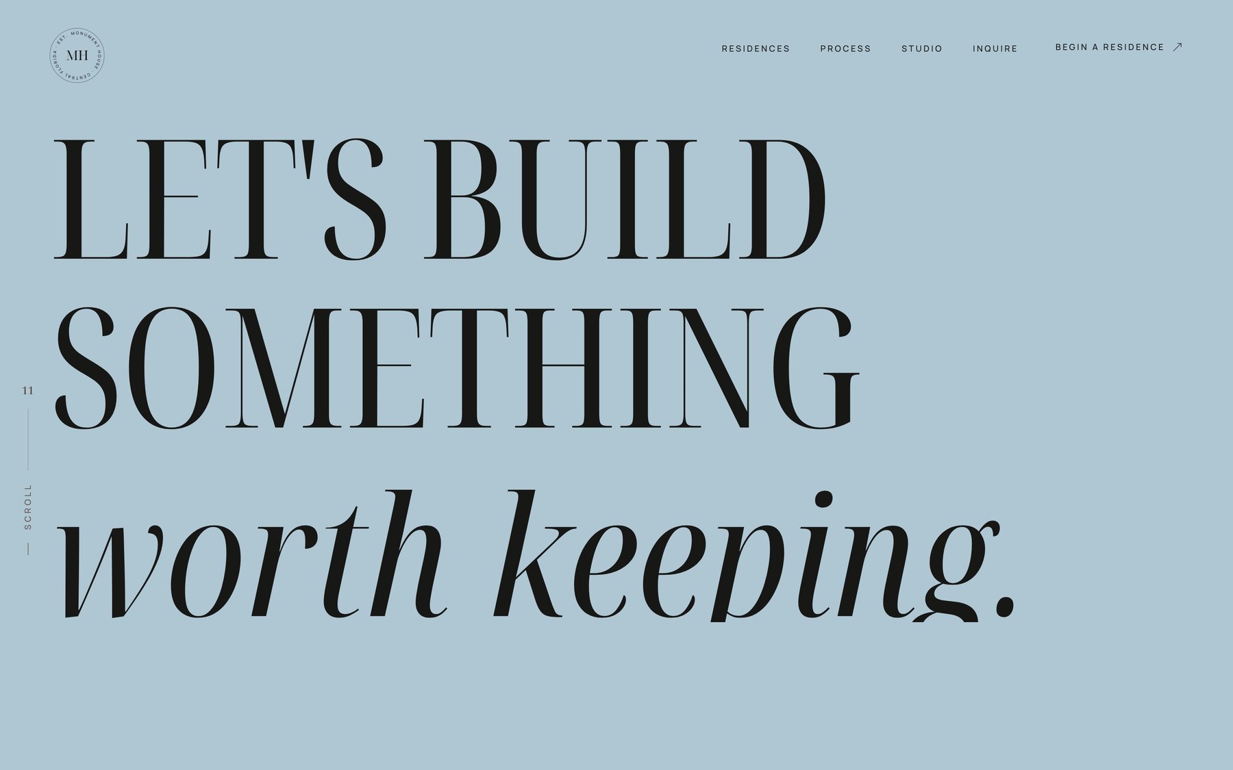
Let's talk about what your firm's site should be.
If you build, design, or furnish homes at this level, we should have a conversation about what your website is currently costing you. No pitch deck — we'll look at your site, your market, and what your competitors are doing, and tell you plainly whether a rebuild is worth it.
What We Did
- Concept Art Direction
- Branded Loading Sequence
- Scroll-Driven Residence Gallery
- Individual Project Pages
- Editorial Typography System
- Responsive Front-End Build