
Website Design for Interior Designers
A prospective client comes from your feed, where the work is curated daily, to a site built once on a theme three years ago. We close that gap — photography-led layout, projects as real pages, and services defined clearly enough to filter the inquiries you keep turning down.

Three Things Wrong With Most Studio Sites
Studios usually assume the problem is that not enough people see the site. Far more often the problem is what happens to the people who already do.
Your website is worse than your Instagram.
That is the uncomfortable version and it is true for most studios. The feed is curated daily and the site was built once, three years ago, on a theme. A prospective client who moves from one to the other experiences a visible downgrade — and the site is where they were supposed to become convinced.
A gallery is not a portfolio.
Thirty projects in a masonry grid that opens a lightbox tells a visitor that you have done thirty projects. It does not let them look properly at the one that resembles their house, understand the brief, see the room-by-room decisions, or find out what it cost. All the persuasion lives in material the grid has no room for.
Nothing on the site says what you sell.
Full-service, e-design, consultation, staging — four different products at four wildly different prices, usually collapsed into a single Services paragraph. Every wrong-fit inquiry a studio complains about traces back to this, and it is fixed with a page rather than with more marketing.
The Work
Interiors, Given Room
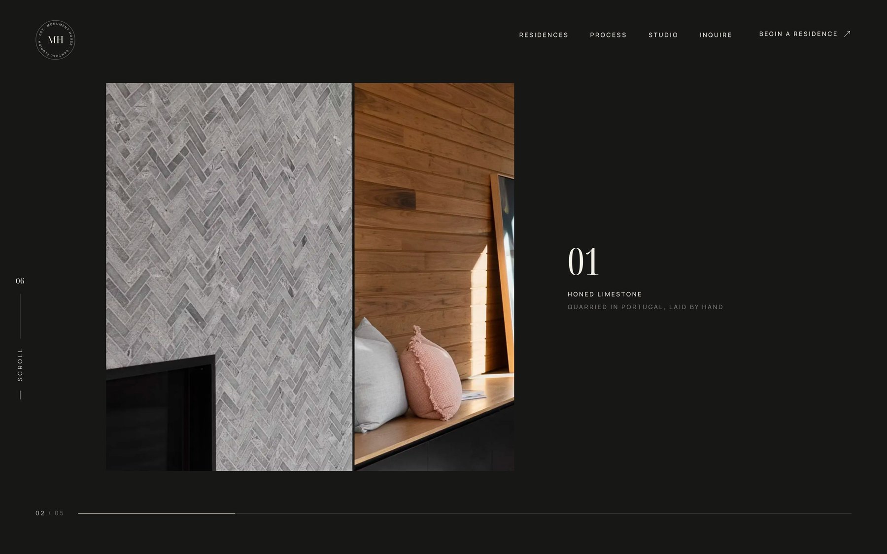
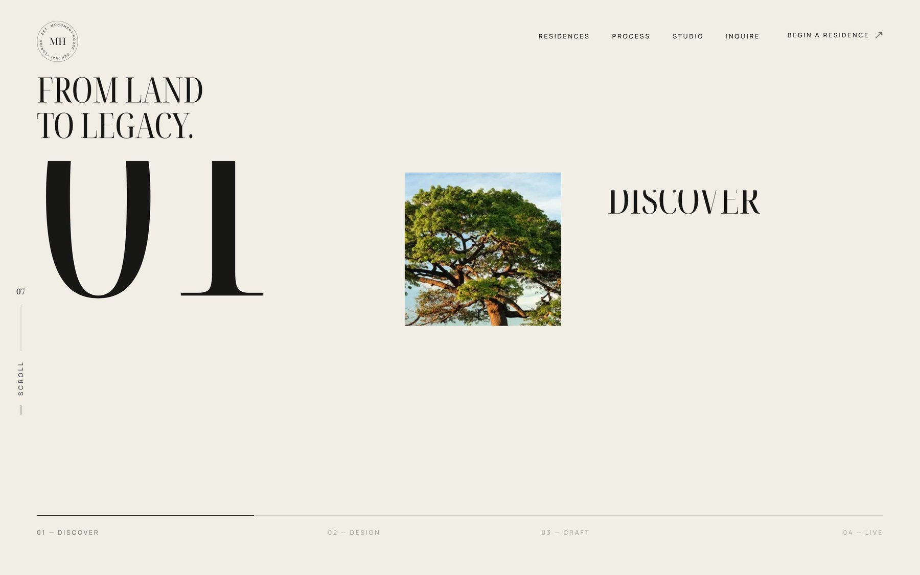
Monument House is our concept build for the luxury residential trades — the interiors and materiality sections are the ones that matter most to a design studio. Springhetti Group is a live client rebuild where the same gallery principles were applied and measured.
Monument House
Concept build


Springhetti Group
Client engagement

Monument House is a concept build rather than a client project. Springhetti Group is a live engagement, and every number attached to it is theirs.
What Goes Into the Build
Six decisions, roughly in order of how much each changes the quality of the inquiries you receive.
Photography-Led Layout
The interface built around your images rather than around them: full-bleed rooms, generous scale, considered crops, and restraint everywhere else. If the site cannot hold up beside your own feed, nothing else on this list matters.
Projects With Room to Breathe
Each project as its own page — the brief, the constraints, room by room, the pieces specified and why. A client wants to go deep on the one project like theirs, and the lightbox is the thing preventing it.
Services Defined as Products
Full-service, e-design, consultation, and staging each given a real page: what is included, how it works, who it suits, and what it costs. This one change usually does more for inquiry quality than a year of content.
Fees and Minimums, Stated
How you charge and what a project starts at. The right client is relieved to find it; the wrong one leaves before either of you spends three weeks finding out. Almost no studio does this, which is exactly why it works.
Designed for the Phone First
This audience browses on a phone, in the evening, often from an Instagram link. If the desktop layout is the real design and mobile is a compromise, you have designed for the minority of your traffic.
Fast With Sixty Images on a Page
Design sites are the heaviest sites on the web and usually the slowest. Modern formats, responsive sources, and proper lazy loading so a full-bleed room renders immediately rather than after the visitor has left.
Who This Build Is For
Studios with professionally photographed work and a site that does not do it justice. If the photography is the weak point rather than the site, we will say so — a beautiful frame around images that cannot carry it is a poor use of the budget.
Adjacent builds for the firms you share clients with: luxury home builder websites and architecture firm websites.
- Full-service residential design studios
- Kitchen and bath design firms
- Studios with strong photography
- Designers working with custom builders
- Commercial and hospitality designers
- Studios repositioning upmarket
Related Pages
A Rebuild Is Also How a Portfolio Becomes Findable
Moving thirty projects out of a gallery plugin and onto thirty real URLs is a design decision and the single largest search gain available to a studio at the same time. That is why web design and interior designer SEO run as one program here — the rebuild is where image SEO first becomes possible at all.
The same structure is what lets your rooms appear in Google Images and in AI search answers for the styles and room types clients search.
For the full channel mix, see marketing for interior designers. Our process is published in full.
Interior Designer Web Design, Answered
What should an interior designer website have that a template does not?
Four things, and only the first is visual. Photography treated as the interface rather than as content inside a container, so rooms get full-bleed scale and real crops. Individual project pages with narrative depth instead of a lightbox, so a client can study the project that resembles their house. Services split into distinct pages with what each includes and costs, because full-service and e-design are different products and collapsing them is what produces mismatched inquiries. And a fee structure with a stated minimum. A template gives you a grid and a Services paragraph, which is enough to prove you exist and not enough to make anyone hire you.
Our Instagram is strong. Is the website still worth the investment?
The stronger the feed, the more the site costs you when it lags — because the feed is generating traffic to it, and every visitor is experiencing the gap. Beyond that, three things the feed structurally cannot do: it does not rank in search, so nobody finds you who was not already looking; it gives no way to go deep on a single project; and it cannot carry the services and pricing explanation that converts interest into a qualified inquiry. There is also the ownership question, which studios tend to take seriously only after an account issue. Every follower is rented on terms that change without notice. The site is the asset you keep.
Should the website show pricing?
At minimum, how you charge and what a project starts at. The objection is that pricing cheapens the brand, and in our experience the opposite happens — vagueness cheapens it, because it reads as either evasive or as a sign the studio is not confident in its own value. The client capable of a full-service engagement is not shopping for the lowest fee, they are trying to establish whether you are in their range at all, and when they cannot tell, most of them simply do not ask. A stated minimum and an explanation of your fee structure filters aggressively, which is what a capacity-limited studio actually needs.
How long does a design studio site take to build?
Six to ten weeks for a site with ten to fifteen properly documented projects, and the bottleneck is content rather than build. It is selecting and organising photography, writing the narrative for each project, and settling the services and fee language — which is genuinely the hardest part, because it forces decisions a studio has often been avoiding. We stage it: launch with your six to eight strongest projects fully documented rather than waiting on the whole archive, then add the rest over the following weeks.
Website Review
Find out why the wrong clients keep inquiring.
We will go through your site the way a prospect does and show you exactly where the fit and fee questions go unanswered.
Find out if AI and Google recommend your company.